A centralized visual presentation tool made for fast-paced creative industries with team collaboration in mind
VISION
2023 UX.UI / PRODUCT DESIGN
In today's fast-paced world the ability to quickly brainstorm and create visually engaging presentations is essential for selling big ideas, winning over teammates, partners, and clients alike. From startups pitching products to investors to art directors selling immersive stories to brands, creative professionals across industries need to be able to generate these presentations quickly and effectively.
00
BACKGROUND
Creating visually appealing presentation decks with current tools is time-consuming, requires specialized skills, and expensive.
The process is tedious, repetitive, and non-standardized. While presentation tools exist, they are often complex, lack standard features, or are not designed for collaboration. This creates a barrier for creative leaders who lack the technical expertise to effectively present their ideas.
00
THE PROBLEM
What if we simplified the whole process of creating and pitching big ideas. Centralizing everything that is needed to make initial concept ideas, keeping everything you need in one space, removing the need to navigate between multiple interfaces we would simplify complex processes and save time, boosting productivity and delivery turn around. This solution removes middle-men, designs for better collaboration, and keeps project management in mind. Sounds too good to be true.
MINIMIZE DISTRACTIONS
OPTIMIZE SYSTEMS FOR FLOW
MAKE COLLABORATIVE
MAKE INTUITIVE
0A
SOLUTION SUMMARY
As an industrial designer, I had my experience as a starting point, but didn’t want to be influenced by my bias. To be thorough, I explored the following research methods.
01
RESEARCH
I first made a survey posting around subreddits, facebook groups, and cold emails. My goals were to identify my potential audience, what programs were being used, and what individual processes or systems that were used. I first assumed I would be targeting the interior design industry, after the initial survey I realized I needed to widen my audience.
SURVEY
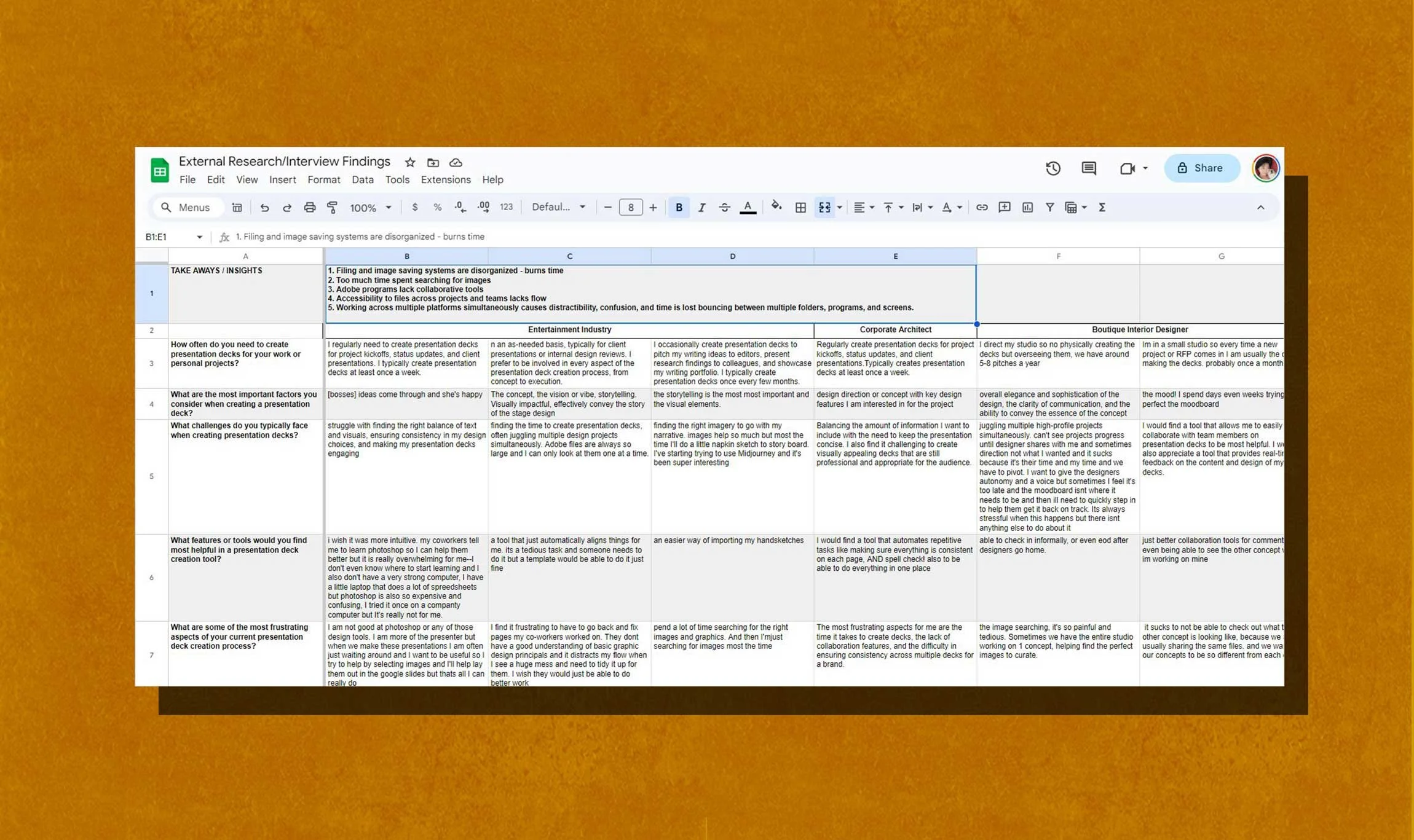
During the user interviews, I selected users from different areas of creative industries, interviewing not only interior designers, but also, designers in entertainment, marketing, and startup/small business owners. I learned, not only, about the how’s and why’s of selected programs and processes, but also, of pain-points, annoyances, and other hiccups within these processes.
USER INTERVIEWS
CONTEXTUAL OBSERVATION
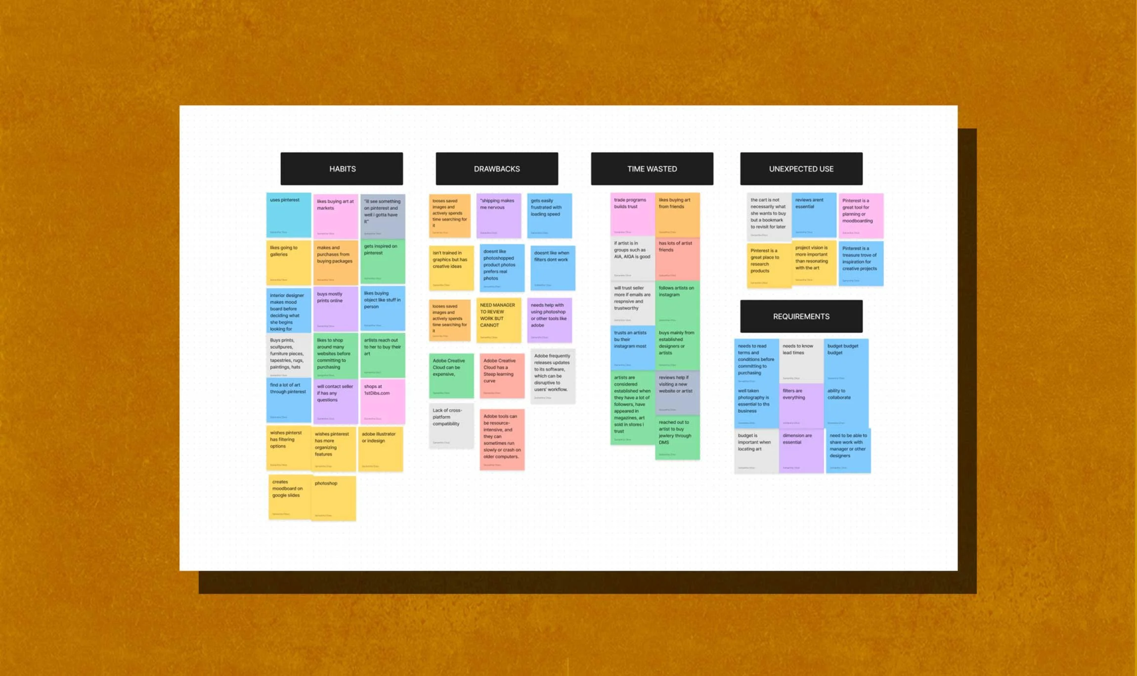
I became a fly on the wall as I observed a small design studio work through their concept presentation. I shadowed multiple designers as they worked through their processes. I was able to identify additional pain-points, redundant tasks, focus disruptors, and most importantly noticed issues not vocalized during user interviews.
Through my previous research, I gathered data on current tools used. Using my research I consolidated the data and began comparing the pros and cons of each tool.
PRODUCT RESEARCH
File and image saving systems are disorganized
Online tools provide collaboration but lack key features
Robust professional tools are expensive and complicated
Accessibility to working files across teams are restricted to one user and/or user must be connected to a server
Switching between multiple platforms disrupts focus and disorients users
02
ANAYLSIS AND INSIGHTS
Speed up and simplify the pitch deck creation process?
Improve file organization for teams?
Provide tools to make image searching easier?
Make accessibility throughout teams more fluid and dynamic?
Remove redundant and complex tasks?
Make integration into existing systems seamless and manageable?
03
HOW MIGHT WE…
My main goal was to create a simple system and workflow that allows for project and asset organization, filtration, while also, providing easy accessibility.
04
IDEATING SOLUTIONS
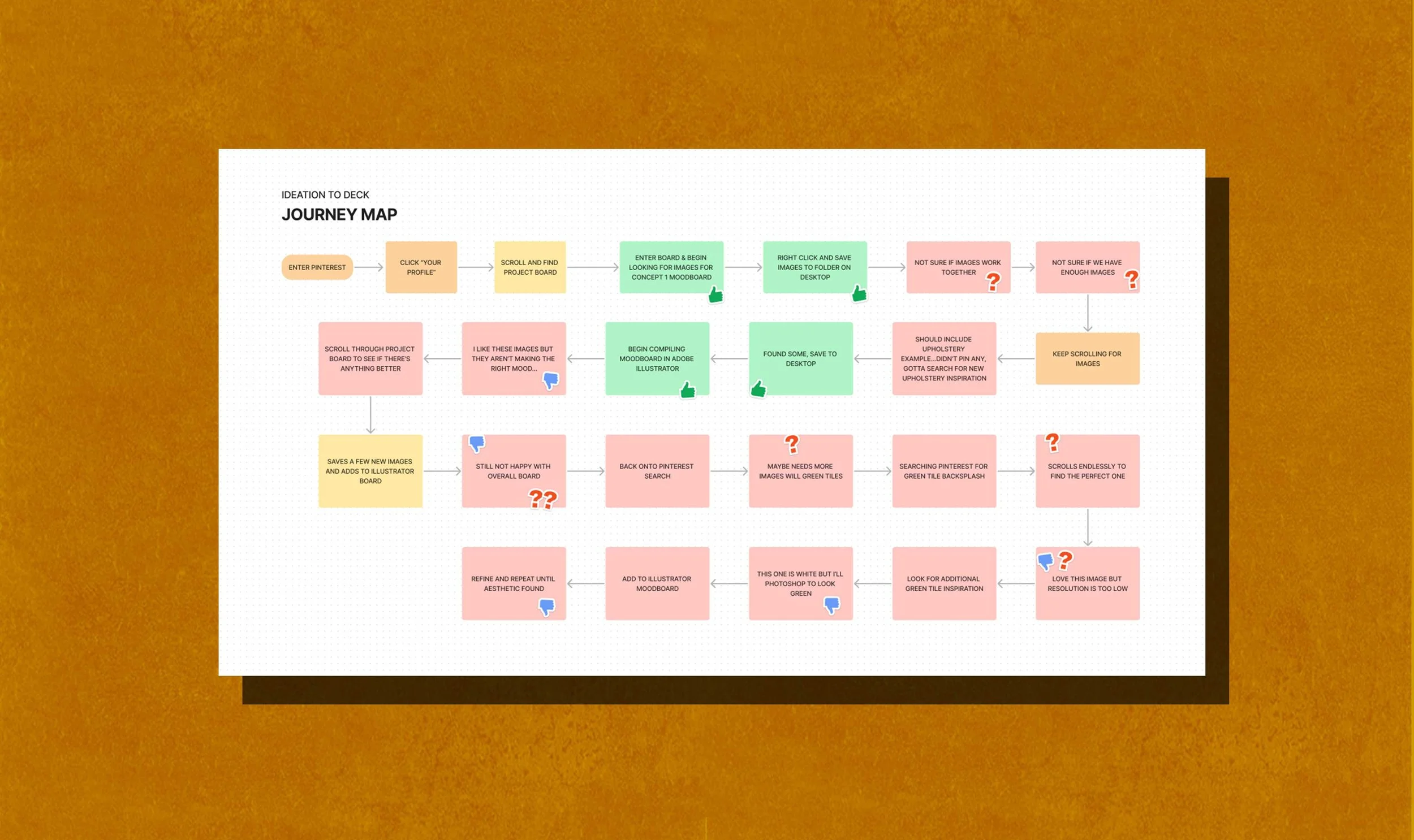
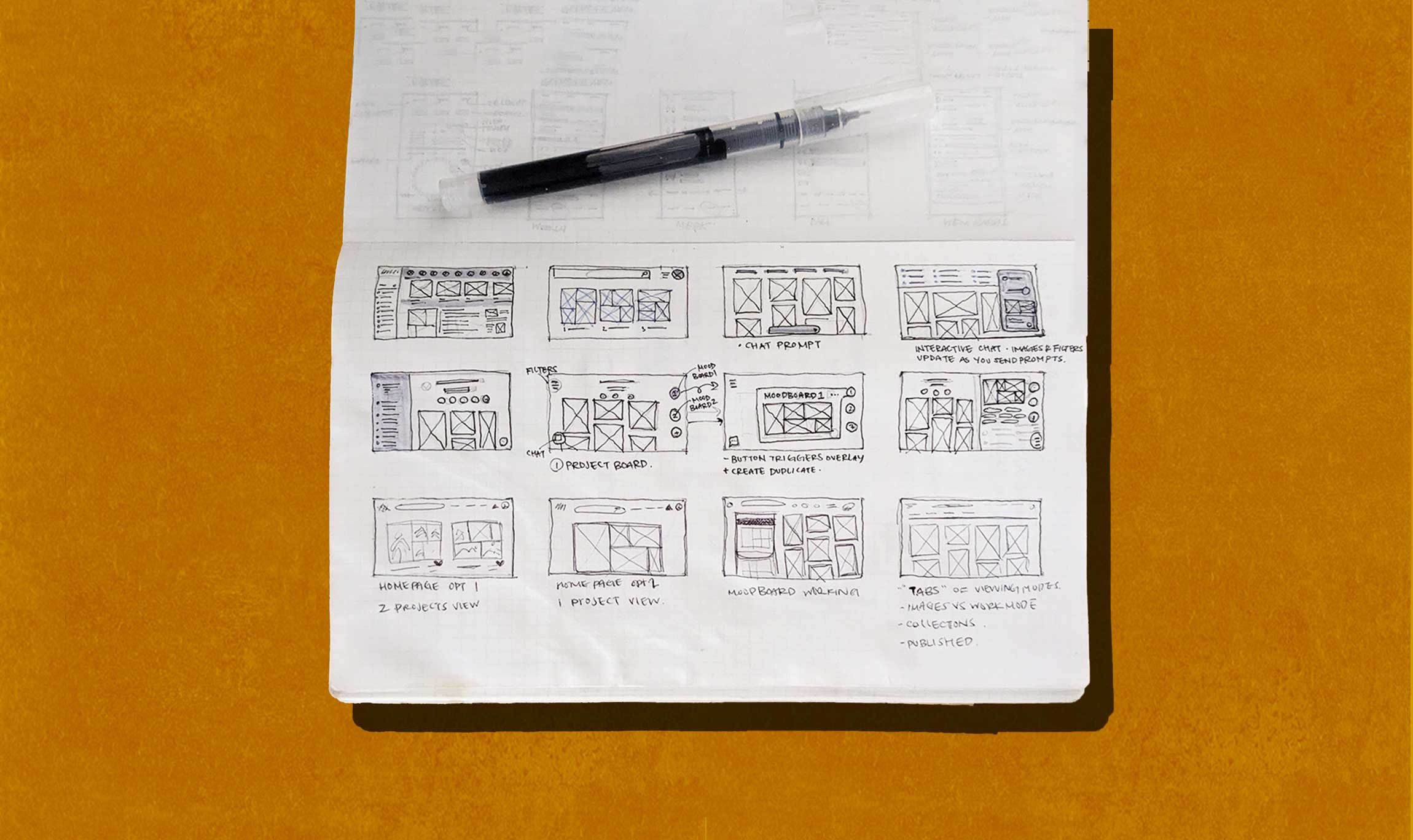
Ideating and sketching a myriad of features including community explore pages, image banks, AI chat prompt, dynamic moodboarding, templates, project pages, product and image search filters, categorization based on mood or aesthetic. I became overwhelmed by the number of features initially dreamt up — I needed to dial back.

Before creating detailed wires, it quickly became apparent I needed to dial back on the number of features I wanted to design for the time frame I was given. Through user insights, I saw a need for a collaborative moodboarding tool where users could search for inspiration and ideate concepts through imagery. I made a list of Now, After, and Later based on this insight.
05
FEATURE PRIORITATION
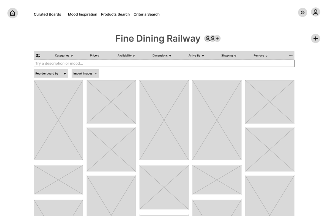
DYNAMIC
EXPLORATION 01
STATIC
EXPLORATION 02
I first wanted to know the usability of the moodboarding feature. I made a mid-fidelity flow mock-up to test on a few potential users.
Through usability testing, I learned:
users want the moodboard to have more editing features, such as undo, redo, save duplicate, and more.
users wished the mooboard didn’t cover any inspiration images.
users loved being able to filter their images by object, category, color etc but wanted a simpler interface
some users did not know what an FF&E sheet was or if they needed one for this tool
some users wished they could add comments, like or dislike images, or add additional notes for their internal team
users wanted to toggle the size of their moodboards and inspiration images
06
USER TESTING
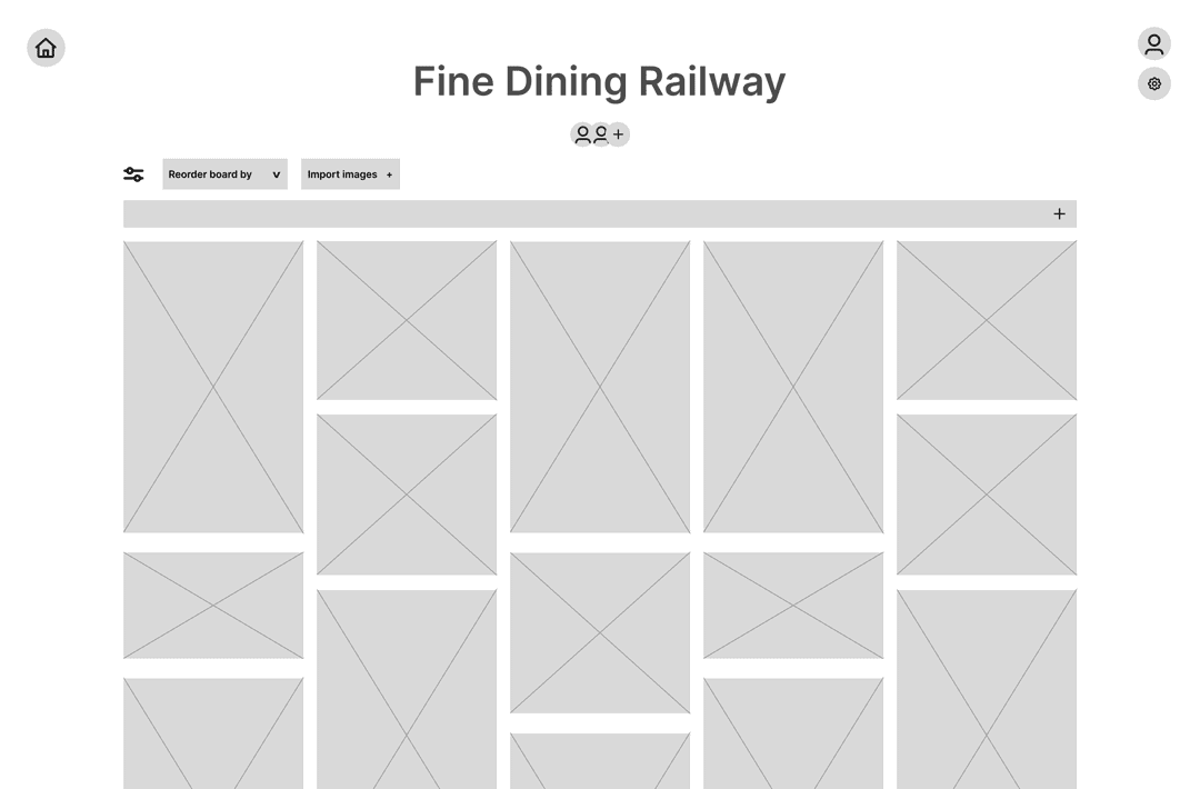
BEFORE
AFTER
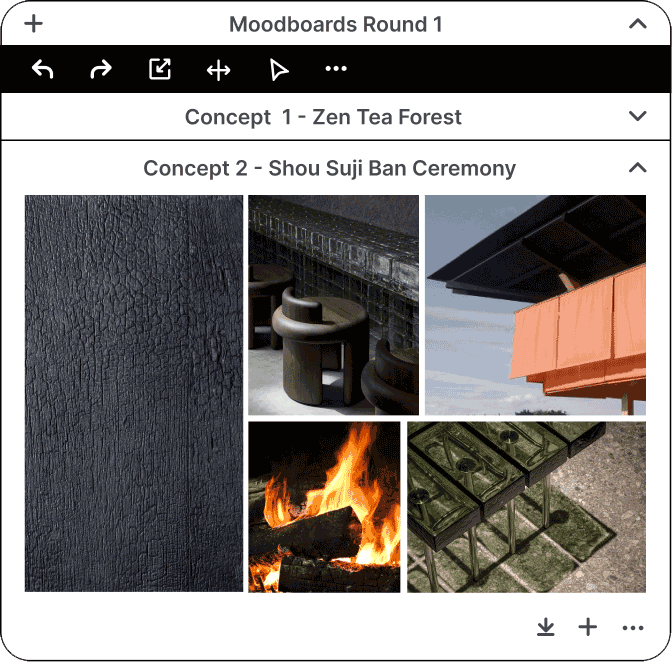
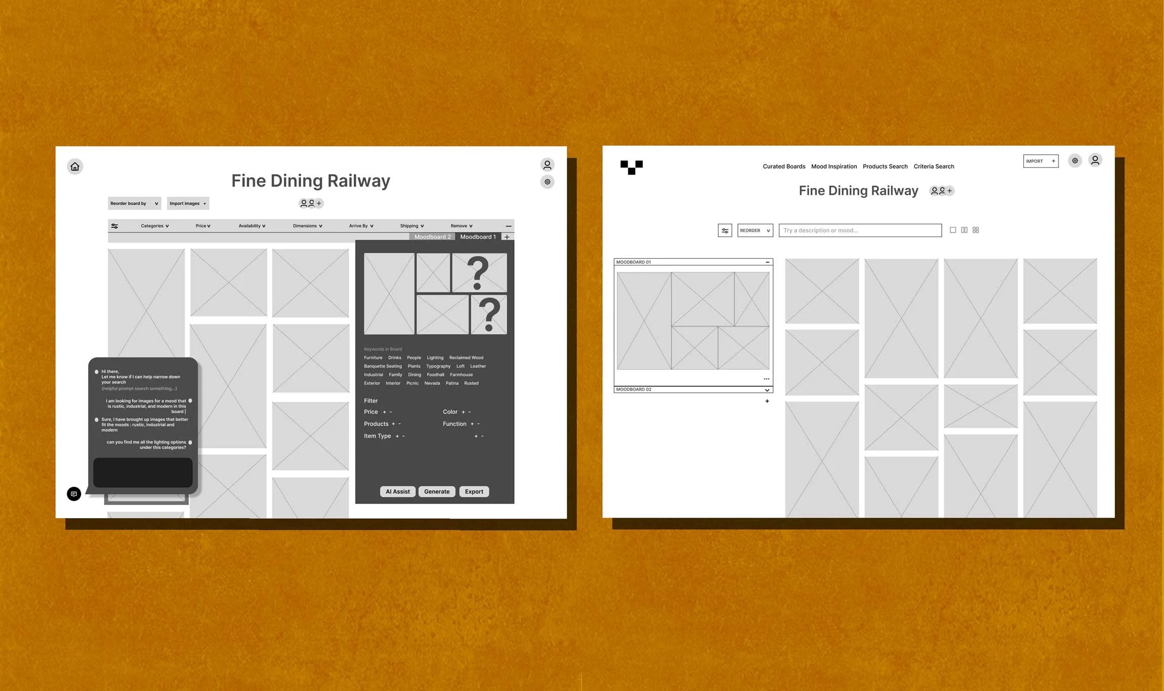
After iterating a few rounds based on user feedback I landed on the “AFTER” image. Simplifying the interface and keeping the static moodboard page, I listened to the main painpoints of my users.
My next step was to design the UI to be ready for a high fidelity mock-up for the next round of user testing.
07
ITERATIONS
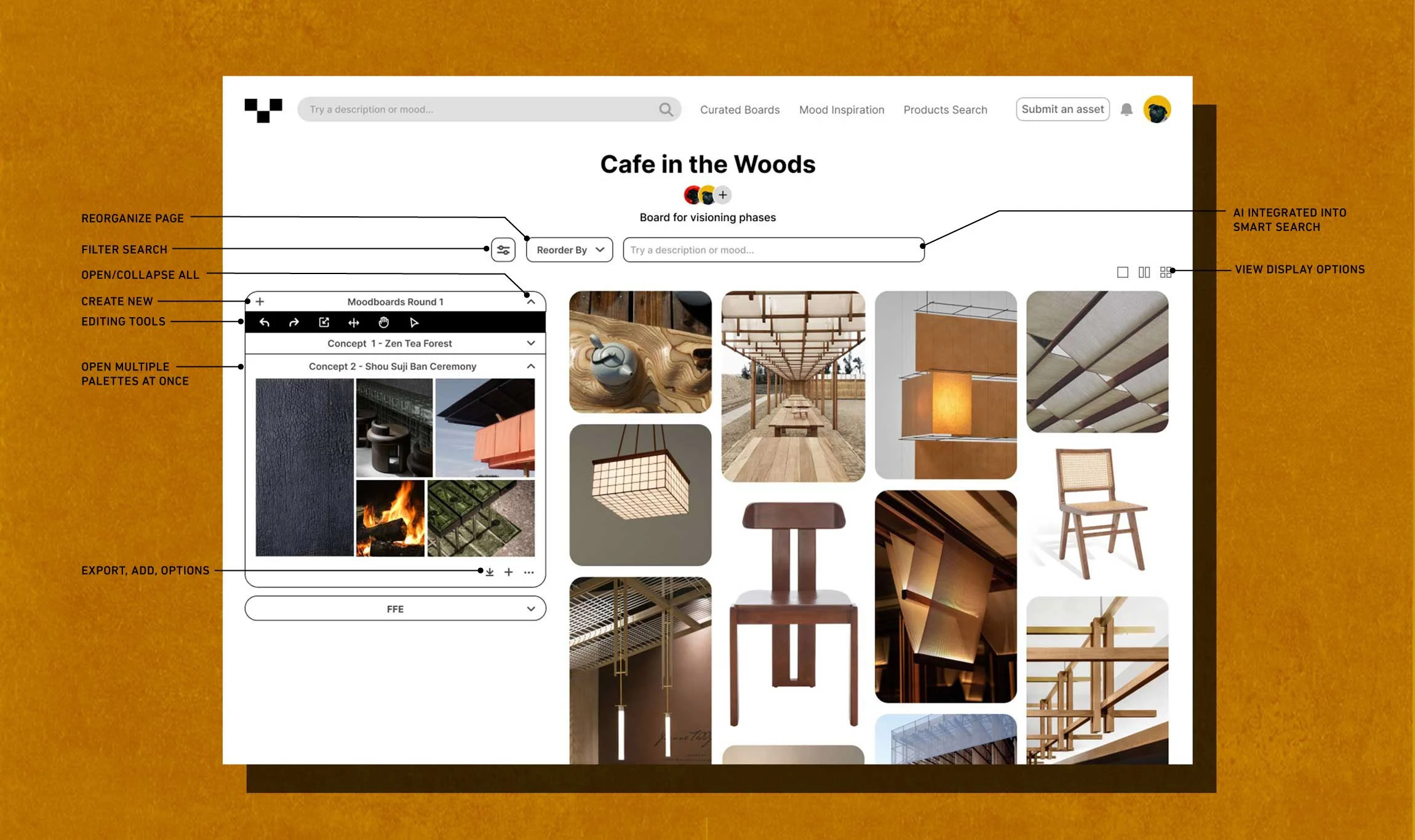
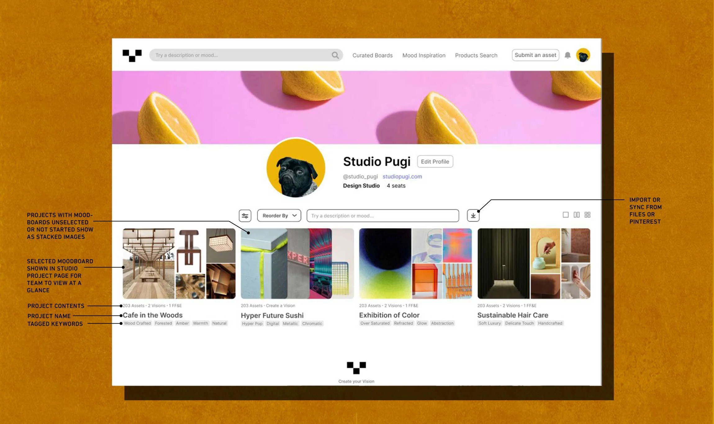
I wanted to UI to feel very familiar. I was inspired by, Pinterest, a central tool used by the creative industry. The UI needed to be incredibly simple to not distract from the imagery. When designing the profile page, I wanted managers and teams to be able to see works in progress, finished projects, and projects not started. I decided add no additional colors, keeping the fonts limited to a san serif.
08
FINAL PRODUCT & PROTOTYPE
Given the short timeframe I had to complete this project, I wasn’t able to design the entire product as I had envisioned. If I had more time to work on this, I would keep building the other pages such as, the community explore pages, the deck creation template pages, and the procedures to submit images to the site. I learned so much about the UX design process through this project, which was my main goal for taking this bootcamp. I really enjoyed the processes and am excited to keep moving forward
09
REFLECTIONS
